Style & Decor
Fall Wedding Color Palettes
By The Hoppenville Team · 5-minute read · Last updated July 12, 2026
Fall gives you a wider color range than any other wedding season, and the estate's materials read differently depending on which family you pick. Here are three palettes that work well against this property's textures, with notes on where each one looks best.
Warm and Rustic: Rust, Amber, and Cinnamon
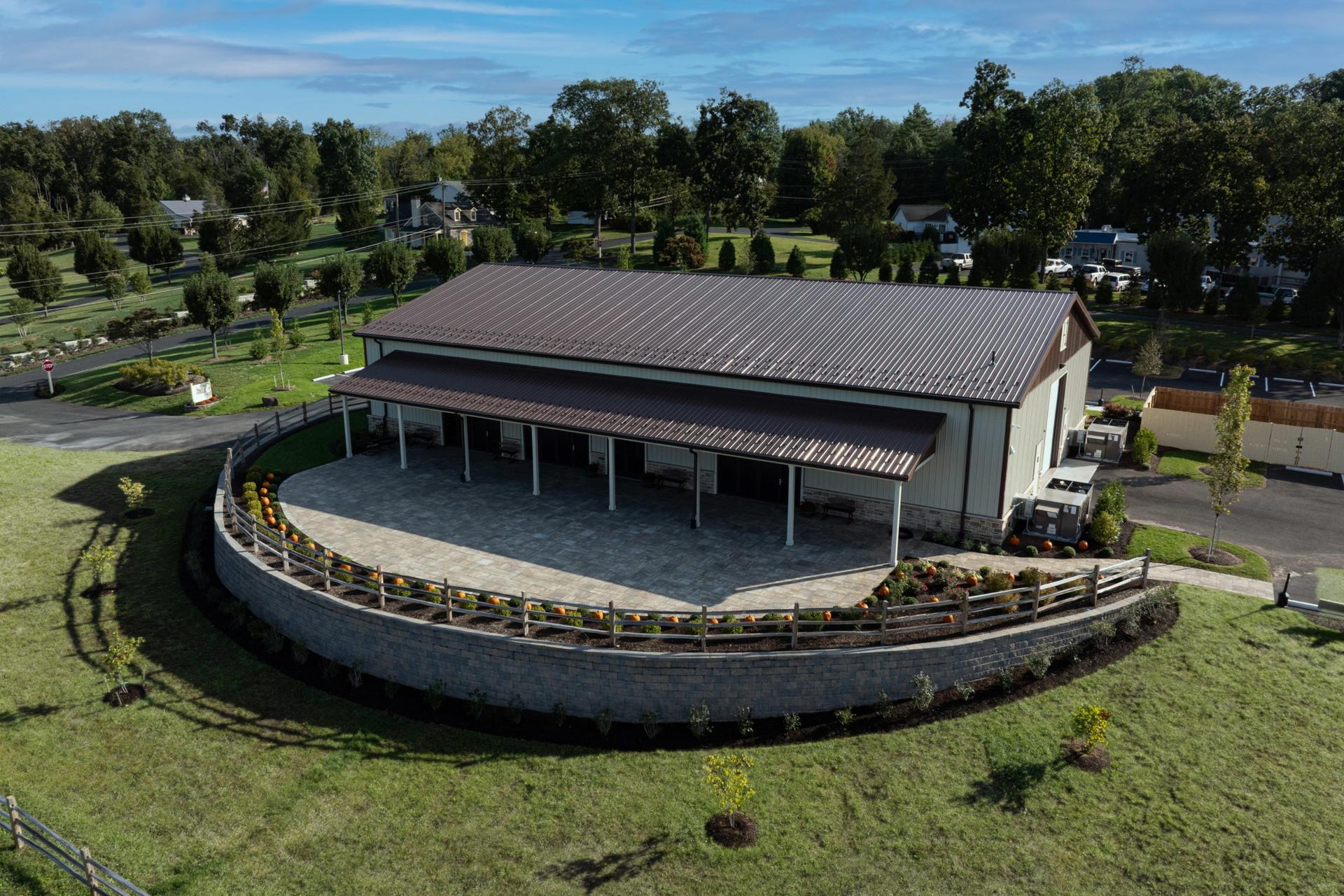
Rust, amber, cinnamon, and a deep gold accent are the classic fall combination, and they sit naturally against exposed timber. The Bank Barn's hand-hewn beams and string-light ceiling already carry these tones, so bouquets and linens in this family look intentional rather than themed. Terracotta or burnt-orange bridesmaid dresses photograph well under the string lights, and a cinnamon or copper suit works for the wedding party without needing much extra styling. If you are marrying on the barn's adjacent lawn, this palette also holds up in open air and afternoon light. Keep one neutral, like cream or ivory, in the mix so the warm tones do not compete with each other in photos.
Muted and Soft: Sage, Dusty Blue, and Oat
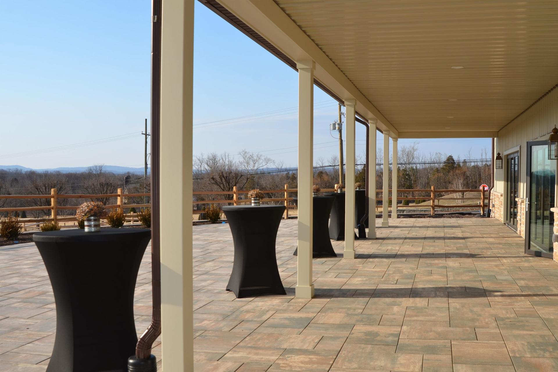
A quieter palette of sage green, dusty blue, and oat or taupe reads as elegant rather than seasonal, and it is a good choice if you want fall without leaning into orange. The Welcome Center's polished concrete floor and stone fireplace are neutral enough to let these softer tones carry the room, especially paired with its 20-foot ceilings and the light coming off the full-length patio. This combination also suits a daytime ceremony on the patio overlooking the gardens, where the muted tones stay legible against greenery instead of washing out.
Jewel Tones: Emerald, Burgundy, and Gold
Emerald, burgundy, sapphire, and gold are a good fit for an evening reception, especially later in the fall when the light turns earlier. These colors hold their saturation under the Welcome Center's wrought-iron chandeliers and next to its stone fireplace, both of which give jewel tones somewhere to reflect. Burgundy and emerald florals also read well against the barn's darker timber if your ceremony and reception are split between the two spaces.
Matching a Palette to the Venue
| Palette | Best suited to | Why it works here |
|---|---|---|
| Warm and Rustic | Bank Barn, adjacent lawn | Timber, string lights, open-air ceremony |
| Muted and Soft | Welcome Center, patio and gardens | Neutral concrete and stone, daytime light |
| Jewel Tones | Welcome Center, evening reception | Chandeliers and fireplace hold saturated color |
Bring Your Florist and Caterer Into It
Outside florists are welcome here, so bring fabric swatches or a sample bouquet to a tour and see how the colors actually sit in the room you are considering. Tours are by appointment Tuesday through Saturday, and seeing the timber, stone, and lighting in person is a better test of a palette than any photo. Catering is exclusive to Robert Ryan Catering & Design or Tosco's Catering, so once you have a palette, loop your caterer in early on linen and tablescape colors so everything from florals to place settings pulls from the same family. And because every venue here has an indoor rain plan at no extra cost, it is worth asking how your palette translates indoors as well as out, so a weather change 24 to 48 hours before your date does not change your color story.
See where your day could happen.
Come walk the 24-acre estate in Pennsburg. Private tours run Tuesday through Saturday by appointment.
Related
Keep reading.
Style & Decor
Barn Wedding Decor Ideas (Photos)
Greenery garlands, Edison lighting, vintage rentals. Barn decor that ages well.
Read the guideStyle & Decor
Museum Wedding Inspiration
How to dress a heritage venue without overpowering its character.
Read the guideStyle & Decor
Winter Wedding Tips (Heating, Transport, Photos)
Weather, hot drinks, ceremony length, and the photo light at 4:30 pm.
Read the guide